Following iPad light painting, we’ve made two films of alternative futures for media. These continue our collaboration with Dentsu London and Timo Arnall. We look at the near future, a universe next door in which media travels freely onto surfaces in everyday life. A world of media that speaks more often, and more quietly.
“The Journey” is the second ‘video sketch’ in the pair with ‘Incidental Media’ – this time looking at the panoply of screens and media surfaces in a train station, and the opportunities that could come from looking at them slightly differently.
The Journey
The other film can be seen here.
There’s no real new technology at play in any of these ideas, just different connections and flows of information being made in the background – quietly, gradually changing how screens, bits of print ephemera such as train tickets, and objects in the world can inter-relate to make someone’s journey that bit less stressful, that bit more delightful.
There’s a lot in there – so I wanted to unpack a few of the moments in the film in this (rather long!) blog post and examine them a bit.
The film can be divided into two halves – our time in the station, and our time on the train.
The train journey itself is of course the thing at the centre of it all – and we’re examining how what we know about the journey – and the train itself, in some cases – can pervade the media surfaces involved in ways that are at once a little less ‘utilitarian’ and a little more, well, ‘useful’…
The first group of interventions could be characterised as the station wrapping around you, helping you get to your seat, on your train, for your journey, with the least stress.
Let’s start at the ticket machine.


The screen supposes two things – that it knows where it is (it doesn’t move around much) and it knows where your train (in this case, “Arthur” – trains are people too!) is leaving from, and when. So why not do a simple bit of reassurance here? It’s twenty minutes to Arthur’s departure and it’s a 3 minute walk.
You’ve got 17 minutes to play with! Get a sandwich? A coffee? Or go and find your seat…
Before we do that I just want to point our something about the ticket machine itself…


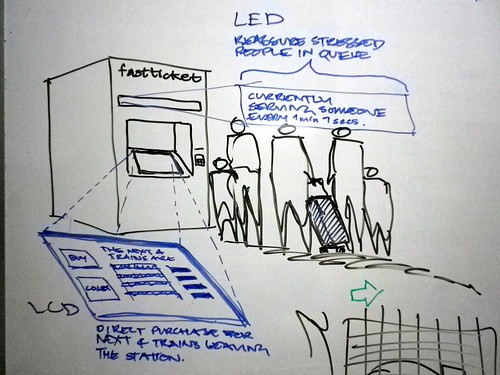
There’s the screen we’ve been interacting with to get our ticket, but there’s also a LED scroller above that.
As you can see in the concept sketch below, we’ve supposed that the scroller could give reassurance to the people in the queue behind you – maybe displaying the average turn-around-time of serving tickets to travellers, so if there is a queue, you’ll know how quickly it might move.
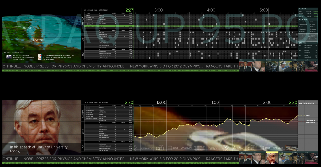
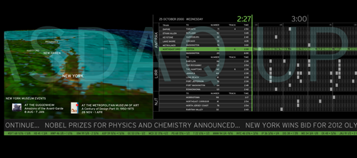
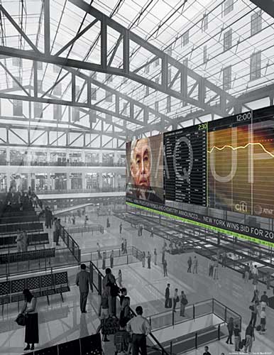
I think when I was drawing this I had in mind the awesome-but-as-yet-unrealised scheme by Lisa Strausfeld and Pentagram NYC for a videowall in Penn Station.
I think I first saw this presented by Lisa Strausfeld at a conference some 8 or so years ago now, but it’s still wonderful. The large video wall has loads of different layers of information kind of interpolated and displayed all at once, at different ‘resolutions’.
So that if you’re approaching the station from down the street you read some overall information about the running of the station that day, and the time, and as you get closer you see news and stock prices, then closer again and you actually see the train times when you get close enough to crane your neck up at them.
Really clever, and a huge influence on us. The notion of several ‘reads’ of the information being presented on the same surface – if handled well, as in the Pentagram proposal – can be very powerful.
We’ve taken a much less high-tech approach, using the multitude of existing screens in the station, but staging the information they present intelligently in a similar way as you approach the platform and your train itself.
For instance, little messages on concourse screens about how busy the station is overall that morning…
As we get to our platform we get the message that the train is going to pretty full but the station systems know where the bulk of reserved seats are, and can give us a little timely advice about where to hunt for a free place to sit…
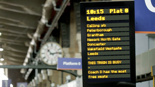

We’ve hinted in this image at a little bit of nice speculative quiet new technology that could be placed by the station workers: magnetically-backed e-ink signs – again displaying reassuring information about where the busy portions of the train will be.

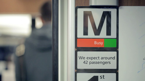
These little inventions have hopefully got you to your train (Arthur, remember?) on time, and in a more of a relaxed state of mind. So, as we board the train we might have time to note that this is Arthur’s favourite route…
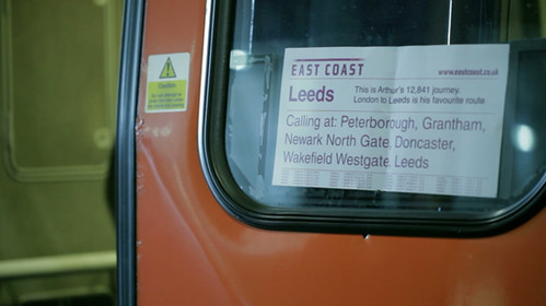

If not, it doesn’t matter. It’s not a functional improvement to your journey but these touches lead to an appreciation of the service’s scale or reach and, if you are a regular traveller, inject a bit of recognition and delight into the otherwise routine.
Once onboard, we continue to explore opportunities for these incidental, different reads of information to both inform and delight.
In the first film ‘Incidental Media’, we introduce the concept of “Print can be quick” – looking at all the printed ephemera around us and how it can be treated as a media surface for more personalised, contextualised or rapidly-updated information.
After all, most of the printed matter associated with a train journey is truly print-on-demand: your tickets, your receipts and, as in this example, the printed reservation stub placed on the seat by the train attendants.
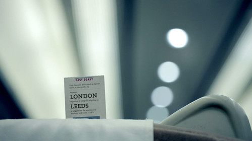

Here we wanted to look to the reassurances and reads that one takes of the reservation stubs as you move down the carriage – either with a reserved seat to find, or perhaps without a reservation on a busy train, opportunistically looking for an unoccupied seat that might be reserved for a latter portion of the train’s total journey.
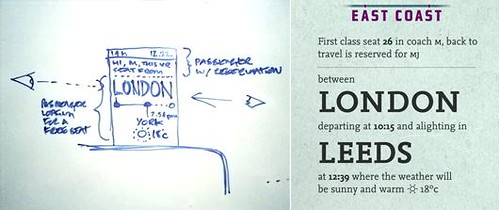
In one of our concept sketches below we’re exploring that first case – could your ticket be the missing jigsaw piece to the reservation stub?
A bit Willy Wonka magic ticket!
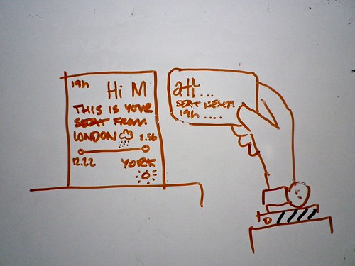

Privacy would be preserved by just using your first initial – printed large with salutations, attracting your eye easily to zero in on your seat as perhaps you struggle down the aisle with your baggage.
The final version used in the film takes this on board, but balances it a little more with the second use-case, that of the opportunistic search for a free seat by someone without a reservation. To answer that case, the portion of the journey that the seat is occupied for is clearly legible, whereas the initials of the traveller are only visible on scrutiny.
If it is indeed your reserved seat, on closer scrutiny you’ll also notice the weather forecast for your destination…
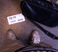
Again – worth noting brilliant past work in this area that’s an influence on this idea. Our friend Brian Suda’s redesign of an airline boarding pass that uses typographical hierarchy of the printed object to reassure and delight.
Here you can see that the time of your flight is clearly visible even if your boarding pass is on the floor.
Lovely stuff.
Finally, some pure whimsy!
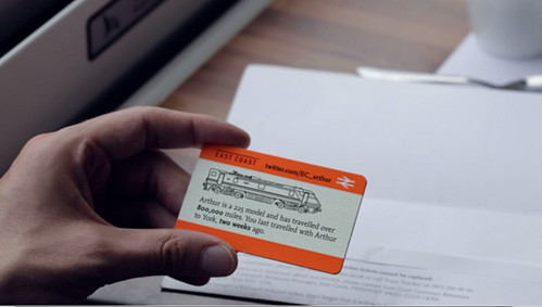
We wanted again to examine the idea that print can be nimble and quick and delightful – creating new forms of post-digital ephemera for collecting or talking about.
First of all, using the ticket to introduce you again to Arthur, your train, and perhaps extending that to recognising the last time you travelled together.
But let’s go further.
We know that we’re going to be passing certain places at certain times, to some accuracy, during our journey.
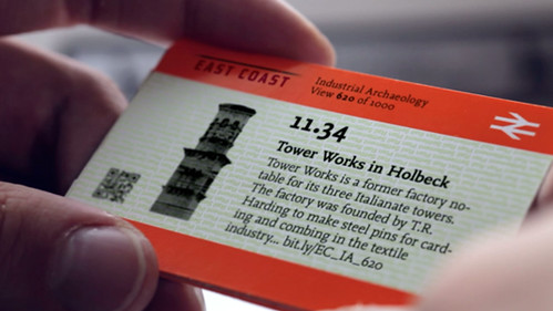
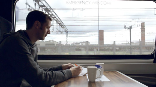
The burgeoning amount of geo-located data about our environment means we could look to provide snippets from Wikipedia perhaps, with timings based on how they intersect with your predicted journey time – alerting you to interesting sights just as they pass by your window.
These tiny, personalised, collectable paper-spimes provide a kind of papernet augmented-reality – giving a routine journey an extra layer of wonder and interest.
As with “Incidental Media”, we’ve tried in “The Journey” to illustrate ‘polite media’ tightly bound to and complimenting one’s context. Media that lives and thrives usefully in the interstices and intervals of everyday routine and technology – indeed ‘making future magic’ instead of the attention arms race that the near-future of urban screens and media could potentially devolve into.
The Journey is brought to you by Dentsu London and BERG. Beeker has written about the films here.
Thank you to Beeker Northam (Dentsu London), and Timo Arnall, Campbell Orme, Matt Brown, and Jack Schulze!


9 Comments and Trackbacks
1. Matt said on 4 November 2010...
Beautiful! I make that journey a lot and still notice magical things from time to time. Now everyone can board at Platform Nine and Three Quarters
If people want to know a little more about Tower Works and some of the other amazing reminders of Leeds’ industrial past, I’m working on a talk for TEDxLeeds next week. (http://www.tedxleeds.com/) I’ll blog some details afterwards.
Cheers,
Matt
2. dom said on 4 November 2010...
Lovely idea!
3. And said on 5 November 2010...
Do you think you can have too much information?
Looking forward to seeing where this goes. Also Beeker @ Dentsu is doing a wonderful job commissioning (and using) thought provoking work. Bravo!
4. Alexei said on 7 November 2010...
To Matt: do you have content for the railway surroundings? We provide you a tool to convert it to AR guide, similar to the the one in video, but you don’t need to spend ink – stories come to your mobile.
To BERG: guys, do you have a client for this? We have an LBS for big brands.
5. Chris said on 30 January 2011...
Some great concepts here, I love the bits where the station is informing you about the traffic, some of this is foregoing too much expediency in favor of friendliness however, for example if I were the guy standing behind the person who decided they need to read all the info on that ticket dispenser and I were particularly late already I would be quite upset. Consider also if you tell people which car will have the most seats you might be violating an uncertainty principle, whereby telling the people where there are the most seats actually may create a shortage of seats in that area. You must be careful that your informational methods don’t create additional and undue stress.
Also while I like the concept of the transportation telling you something about your surroundings (I would love something like this when on long range train trips particularly) I cannot agree with any system which would make so much (potentially) waste material compulsory, perhaps it could be optional, or displayed on the windows, or on a screen near the windows so as not to obscure the view, but giving every passenger 4 or 6 bits of (again potentially) garbage to carry is a horrible practice.
Trackback: sioface: Things 21 November 2010
[…] Here’s an impressive write up of a project from Berg / Dentsu. They always seem to churn out impressive stuff that I could dribble over all day. I highly recommend all the design and usability nerds to take a look-see at this. The whole project strongly revolves around their concept of media surfaces. They do an excellent job of conveying important information while being quite playful with the old and new, turning the seemingly mundane into something interesting. Astrological Tower Gets Video Mapped […]
Trackback: Backup Brain » Blog Archive » My design heroes 11 March 2011
[…] on their own, but their work together at Berg London is especially fascinating. Their video sketch “The Journey” was one of the most beautiful and elegant concept videos I’ve seen. I suppose they do […]
Trackback: Incidental Media & The Journey | Joshua Lee Stone 1 October 2012
[…] Part of a collaboration between Dentsu London and BERG. You can read more about both films at Dentsu London’s blog MediaSurfaces and on BERG’s blog here and here […]
Trackback: What is the latest Guardian Headline dot com | 19 February 2013
[…] generally kicked off by, but unrelated to BERG’s Media Surfaces: The Journey, big font and a single page inspired by the many other single serving sites out there. On a black […]